A wave of books and exhibitions on the subject of Otto Neurath’s work in visual communication – now commonly referred to by its own main name of Isotype – made itself felt some years ago in the Netherlands.(1) I wrote about this an article in the Hyphen Press website, here: http://www.hyphenpress.co.uk/journal/2008/05/12/isotype_recent_publications . Among them was Lovely language edited by Ed Annink and Max Bruinsma. This was a rag-bag book that went together with an exhibition of the same name. It was published by its printer, Veenman, in 2008. Veenman has since gone out of business as a publisher and that book now suffers a shadowy presence in the market. Gerd Arntz: graphic designer, released last December, is a further publication from the group that made that book.
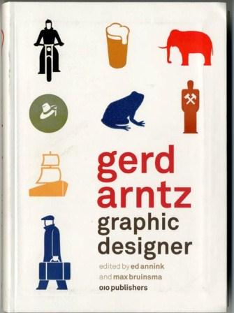 This new contribution, also under the editorship of Ed Annink and Max Bruinsma, recycles some of the material of the earlier work, and uses the same intensively, but at the same time loose, ‘everything-thrown-in’ approach. A book about Gerd Arntz and his work would be a good thing to have.(2)Among the previous publications that describe Arntz’s work, one stands out: a book published under his own name and edited by the art historian Kees Broos, Tijd onder het mes: hout- & linoleumsneden (Nijmegen: SUN, 1988. His production as a ‘free artist’ in Germany in the 1920s is interesting and significant; as a designer of symbols with the groups led by Otto Neurath he was a master.(3)‘Symbol’ is the English word that has been often used to refer to these things; there are grounds for using another term, notably ‘pictogram’. On this occasion I will stick with ‘symbol’. But to describe and understand his work as artist and designer one needs to see him in relation to his colleagues, his commissions, his times. This monograph sees Arntz in isolation, and its approach is again that of the rag-bag: a collection of bits and pieces that its editors have stumbled upon.
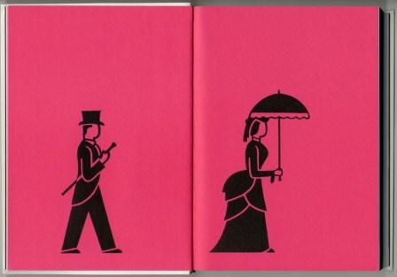
 The book opens with a sequence of fourteen pages, each showing Arntz’s symbols. The effect of the sequence is cinematic and pretty: the background tint is intensified from light through to dark pink; the symbols increase in size (against Otto Neurath’s dictum of ‘repetition not increase in size’). One tries to find some meaning: does the sequence represent the passage of history? But there is no meaning here. It is just decoration. These opening pages already betray the spirit of the work they present.
 In a note before the introduction, Ed Annink tells the story of an early use he made of Arntz’s symbols, already familiar from Lovely language (pp. 12-13). He took silhouettes (a hippo and a hare) drawn by Arntz, and got doormats made from them: ‘Still in production, the doormats are distributed by the Dutch design brand Droog.’ Another use followed:
A few years ago, I came into contact with Kwantum, a discount store boasting some 100 large stores across the Dutch-speaking Lowlands. I thought it would be great if Gerd Arntz’s Isotypes would show up in mass consumer products, thus providing his imagery with a very large audience. By now, seventeen different pieces of white china crockery decorated with silvery projections of Arntz’s Isotypes have been produced, under the tongue-in-cheek designation ‘I want the one with the egg’. (p. 18)
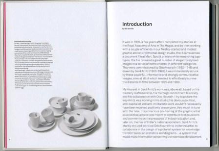 In his introduction, which opens on the facing page, Annink refers to Arntz’s ‘political, anti-capitalist’ work. The artist who in the 1920s aligned himself with the radical left in Germany and made strong analytical depictions of class society now finds, posthumously, his images turned into doormats and applied to the plates and cups of a discount store. There is a large historical irony at work here, but Annink shows no awareness of it.
After this brief introduction, the book’s other editor, Max Bruinsma, provides an essay about Arntz. The acknowledgement of sources reads: ‘This text is based to a large extent on a lecture by Gerd Arntz’s son Peter Arntz (1924-2009) in 2007, and an interview shortly before his death, in July 2009.’ (p. 50) Any decent researcher will do more than consult one source, especially one so close to the subject; one might add ‘and especially one so far from the subject’, because Peter Arntz had no special knowledge of art or design.
Bruinsma casts his text in the present tense: ‘In Düsseldorf, where he lives since his nineteenth, he joins a movement which wants to turn Germany into a “Raden Republik” (‘council republic’), a radically socialist state form based on direct popular democracy.’ (Incidentally, this slightly broken English runs through the whole book.) The effect of this over the ten pages of the introduction is tiring. We hear Max Bruinsma, microphone in hand, giving a blow-by-blow narrative of Gerd Arntz’s life and work, as if he was a radio sports commentator. Bruinsma was not there at any of these events: he is just pretending that he was. Given the lack of documentation or qualification in this text, I cannot believe that any of these sentences is true.
Some of the sentences can be shown to be wrong:
In Vienna, Arntz improves the quality of design at the museum and soon becomes involved, not only in making exhibitions but also in designing the first visual statistics as charts to be displayed in the museum or to be published in books or ‘Mappen’, loose-leaf collections of charts. (p. 31)
Arntz started work in Vienna in September 1928; ‘visual statistics as charts to be displayed in the museum’ were made at the start of the museum in January 1925, so too books and ‘Mappen’ were published before September 1928.
As a model for visual statistics, the atlas is a success. In 1931, this leads among other things to an invitation to come to the young Soviet Union and set up an institute for visual statistics in Moscow, Isostat, an institution which directly reports to the Soviet Central Committee. (pp. 33-4)
A more precise and nuanced description of what happened would be this:
In 1931 Otto Neurath, Marie Reidemeister and Gerd Arntz travelled to Moscow to assist the Soviet authorities in establishing an institute for pictorial statistics and to train Soviet designers and technicians in the Vienna Method. The institute, which existed from 1931 until 1940, was named the ‘All-union institute of pictorial statistics of Soviet construction and economy’ (Всесоюзный институт изобразительной статистики советского строительства и хозяйства), commonly abbreviated to IZOSTAT (ИЗОСТАТ). http://www.isotyperevisited.org/2009/09/pictorial-statistics-and-the-vienna-method.html
This account makes it clearer that the group from Vienna were there as consultants; that it was not just ‘Arntz and Neurath’ who were involved, but others. Also the name of the Soviet institute is properly transcribed as Izostat, not Isostat.
A third instance:
Neurath’s later partner Marie Reidemeister – then a ‘transformer’ in his team, meaning she edited the often complex information Neurath wanted to convey into discrete sets of data – joins them [in the Netherlands] from Vienna in the same year [1934]. (p. 38)
At this point it will be as well to explain the large misunderstanding that underpins this book and the whole effort of the presentation of Arntz’s work undertaken by Max Bruinsma and Ed Annink, including the Arntz website http://www.gerdarntz.org/.
Otto Neurath established his Gesellschafts- und Wirtschaftsmuseum at the start of 1925. He had been running a museum of housing and wanted to turn it into something more, to explain not just Vienna and its housing, but the ‘social and economic’ more widely. A crucial step in this development was his meeting with Marie Reidemeister, in October 1924. ‘Now I know that I can do it’, she reported him as saying. Marie Reidemeister joined the new venture on 1 March 1925.(4)See her account ‘Wiener Methode and Isotype: my apprenticeship and partnership with Otto Neurath’ in: Marie Neurath & Robin Kinross, The transformer: principles of making Isotype charts, London: Hyphen Press, 2009, and especially the note on page 10 of that book.
Reidemeister learned the work of transformation from Otto Neurath. This was not the activity of editing complex information into discrete sets of data, in Bruinsma’s formulation. Marie Reidemeister (later Neurath) once described it in this way:
From the data given in words and figures a way has to be found to extract the essential facts and put them into picture form. It is the responsibility of the ‘transformer’ to understand the data, to get all necessary information from the expert, to decide what is worth transmitting to the public, how to make it understandable, how to link it with general knowledge or with information already given in other charts. In this sense, the transformer is the trustee of the public. He has to remember the rules and to keep them, adding new variations where advisable, at the same time avoiding unnecessary deviations which would only confuse. He has to produce a rough of the chart in which many details have been decided: title; arrangement, type, number and colour of symbols; caption, etc. It is a blueprint from which the artist works.(5)Neurath & Kinross, The transformer, pp. 77-78.
The transformer was thus, we would say now, the designer of the Isotype work: she or he ordered the material and put it into visual form. Annink and Bruinsma imagine that Arntz was the principal designer, but he was not. Vivid proof of this can be found when one looks through the charts made at the museum from 1925 to 1928, before Arntz joined. It was a time of continuous experiment and self-critical development, during which all the main principles of configuration were worked out. This was the achievement of Marie Reidemeister and Otto Neurath, and others who engaged in the work – Friedrich Bauermeister among them.
Annink and Bruinsma describe Arntz sometimes as ‘design director’ or ‘art director’ at the Museum. This is a truer (if anachronistic) description than ‘designer’. He did have an eye for the more peripheral aspects of the charts: the titles, captions, and their typographic treatment. Though the decision to acquire Futura type at the museum was not Arntz’s. He told me, when I interviewed him in the 1970s, that this type had already been acquired when he arrived.(6)In 1975-9 I undertook research on Isotype in the archives at the University of Reading and elsewhere, and interviewed those who had been involved with the work, especially Marie Neurath, and including Gerd Arntz. My MPhil thesis at Reading (1979) was never published. The chapter that discussed principles of the design of the charts will be published in an anthology of essays on Isotype, now in active preparation at the Department of Typography at Reading. Arntz also knew other artists who could join in this work of drawing symbols, and some of those who joined the Museum in its time of greatest production (1928-30) came through him. But the work was always team work, and Arntz took his place in the group as the brilliant designer of symbols to be used in something larger – whole charts. They were never meant to be seen on their own.
 The editors of this work never get to grips with their subject. These symbols were drawn to sit in rows. They were units to be repeated. In the gathering of comments by designers that follows Bruinsma’s piece, Nigel Holmes (in a piece previously published in Information Design Journal) hovers around this thought, without ever picking it up. Two measured drawings by Arntz are shown (pp. 54-5). These are nice examples of the symbols made into modules: perfectly symmetrical and with the weight of the forms distributed so that they can sit happily in rows. But these drawings are shown without any interpretation, or date, or scale (from Arntz’s measurements on the drawings, one can see that they have been slightly enlarged – without reason).
 A remark in a caption gives Annink and Bruinsma away. They notice that in an array of symbols drawn by Arntz for the Izostat Institute there are some that show groups rather than single figures. Bruinsma and Annink write: ‘Remarkable is the diagonal arrangement of figures in groups, a formal arrangement that Arntz didn’t use for his Vienna symbols.’ (p. 38) But the decision to draw symbols in clusters of (typically) five was not Arntz’s. He did this at the request of the designer of the chart: the transformer, who had worked out what to show, with how many units, at roughly what size, and in which colour.
So throughout the book no attempt is made to relate the individual symbols to their uses. One can imagine a fascinating research project that would trace symbols in the files to their use in charts. Reuse of symbols in different charts was the ideal, but how often did it actually happen? Many of the symbols whose prints are pasted into these folders were, I strongly suspect, used just once: the folders acted more as an inventory of symbols made, rather than a bank for future use. Historical and contextual placing is the way to bring something alive. Here this wonderful material is allowed to die.
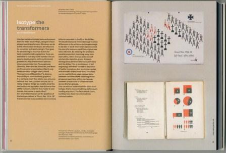 The one attempt here to consider configuration of material and transformation comes in the comments by Erik Spiekermann, writing about the ‘Great War 1914-18’ chart. These thoughts were first written in a review of the book review in Eye magazine (no. 73, 2009). Spiekermann restates my own discussion of this chart in the book he is reviewing, The transformer.(7)The book (see note 4) contains Marie Neurath’s account of her work, supplemented by my comments. Here the design of Annink and Bruinsma’s book lets him down: the big chart (42 x 63 cm) is shown the same size as the small format book International picture language (15 x 20 cm, when opened). This visual lie is enforced through placing them on the same background. Again, the designers of Gerd Arntz: graphic designer show themselves to have learned nothing from Isotype and its drive to truthful representation.
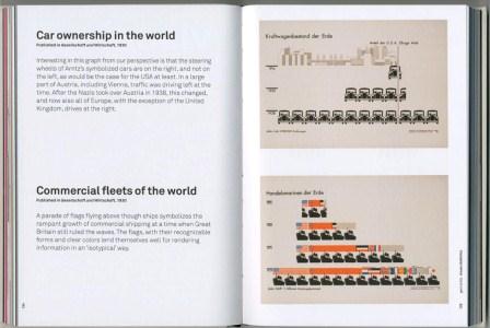 The book carries on in the same way. Gerd Arntz’s political prints are shown, one per page, with captions facing – some of which borrow from already published texts, leading to an unhappy lumpiness in the book’s commentary. A selection of Isotype charts is reproduced. Those from the ‘Atlas’ Gesellschaft und Wirtschaft have captions written first for Lovely language. They do not improve with this recycling.
Interesting in this graph from our perspective is that the steering wheels of Arntz’s symbolized cars are on the right, and not on the left, as would be the case for the USA at least. In a large part of Austria, including Vienna, traffic was driving left at the time. After the Nazis took over Austria in 1938, this changed, and now also all of Europe, with the exception of the United Kingdom, drives at the right. (p. 124)
In their fixation on symbols, Annink and Bruinsma thus aim, at tedious length, at the only uninteresting and insignificant element in the chart.
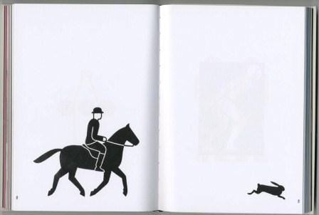 The last part of the book, entitled ‘visual stories’ – 120-odd pages – is filled with symbols, without comment, although prefaced by the remark that ‘since these small images constitute a visual language, one can write little stories in them …’ These spreads are driven by a weak humour.
Gerd Arntz: graphic designer is a big shame, and a horrible waste of effort and material. It shows the dangers of image-driven designers leading a project without intelligent editorial advice. According to the imprint on the title page and in the colophon the publisher is 010 in Rotterdam. The book, which was published in December 2010, is not listed in 010’s current printed catalogue (distributed from October 2010 onwards): it must have been a sudden birth. There is no evidence that 010 had anything to do with the book’s writing, editing, or production, but they must bear the responsibility for putting it into the world.(8)The book has been promoted by an energetic publicity campaign. Jobbing commentators have responded with enthusiasm. Further, it was chosen in the ‘best designed Dutch books’ event of 2010 and given a medal in the German ‘best designed book’ event held in Leipzig in March of this year. A log of all this can be found on the Gerd Arntz website http://www.gerdarntz.org/content/media.
Robin Kinross
Robin Kinross is a publisher and writer on design based in Londen. www.hyphenpress.co.uk
noten
| 1. | ↑ | I wrote about this an article in the Hyphen Press website, here: http://www.hyphenpress.co.uk/journal/2008/05/12/isotype_recent_publications . |
| 2. | ↑ | Among the previous publications that describe Arntz’s work, one stands out: a book published under his own name and edited by the art historian Kees Broos, Tijd onder het mes: hout- & linoleumsneden (Nijmegen: SUN, 1988. |
| 3. | ↑ | ‘Symbol’ is the English word that has been often used to refer to these things; there are grounds for using another term, notably ‘pictogram’. On this occasion I will stick with ‘symbol’. |
| 4. | ↑ | See her account ‘Wiener Methode and Isotype: my apprenticeship and partnership with Otto Neurath’ in: Marie Neurath & Robin Kinross, The transformer: principles of making Isotype charts, London: Hyphen Press, 2009, and especially the note on page 10 of that book. |
| 5. | ↑ | Neurath & Kinross, The transformer, pp. 77-78. |
| 6. | ↑ | In 1975-9 I undertook research on Isotype in the archives at the University of Reading and elsewhere, and interviewed those who had been involved with the work, especially Marie Neurath, and including Gerd Arntz. My MPhil thesis at Reading (1979) was never published. The chapter that discussed principles of the design of the charts will be published in an anthology of essays on Isotype, now in active preparation at the Department of Typography at Reading. |
| 7. | ↑ | The book (see note 4) contains Marie Neurath’s account of her work, supplemented by my comments. |
| 8. | ↑ | The book has been promoted by an energetic publicity campaign. Jobbing commentators have responded with enthusiasm. Further, it was chosen in the ‘best designed Dutch books’ event of 2010 and given a medal in the German ‘best designed book’ event held in Leipzig in March of this year. A log of all this can be found on the Gerd Arntz website http://www.gerdarntz.org/content/media. |
